Dr. LalPath Labs
Overview
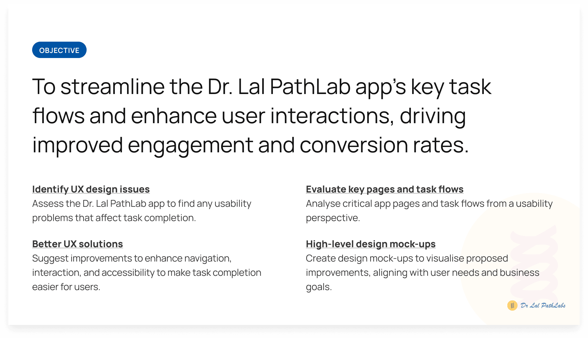
A centralised digital platform designed to streamline the operations of CBG (Compressed Bio Gas) plants across India. It integrates scattered data from input materials to output generation, enabling real-time visibility, operational efficiency, and informed decision-making through intuitive dashboards and role-based access.
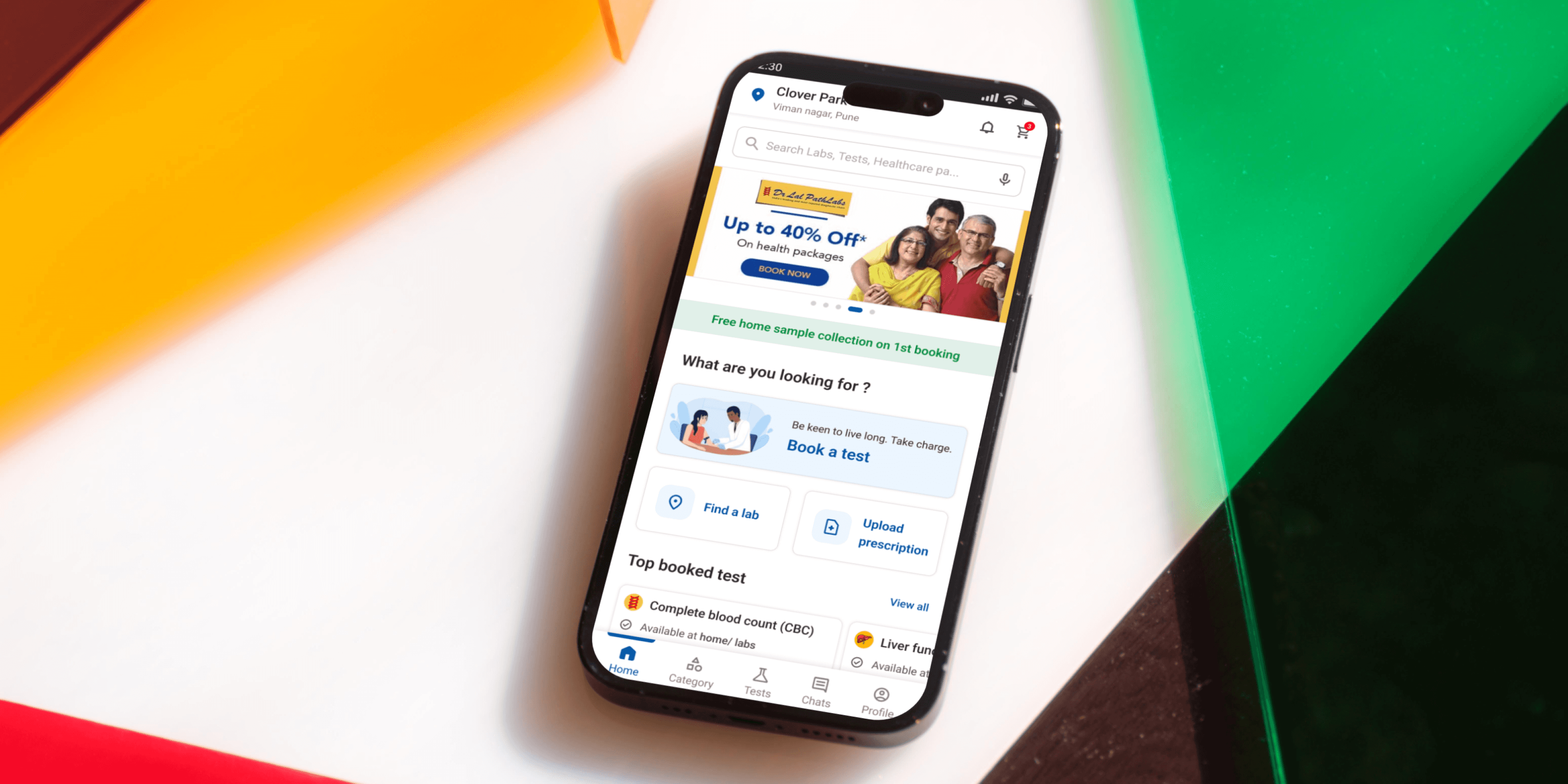
When I first looked into the Dr. Lal PathLabs app, it was clear that the brand had the right intentions — to make healthcare accessible, quick, and reliable. But as I dove deeper, the experience didn’t match that promise.
Users were getting lost in the app.
Some struggled to book a simple test, others weren’t sure how to schedule a home collection, and many couldn’t find their old reports when they needed them most. For something as sensitive and urgent as health, the experience felt clunky and disconnected.
Even regular users shared frustration:
“I’ve done this before, but I still don’t know where to go.”
This friction didn’t just affect users — it impacted the business.
1. There were booking drop-offs before completion
2. A rise in support calls
3. And a loss of user trust in the app’s reliability
This was a brand people relied on for health, but the app wasn’t holding up its end of the bargain.
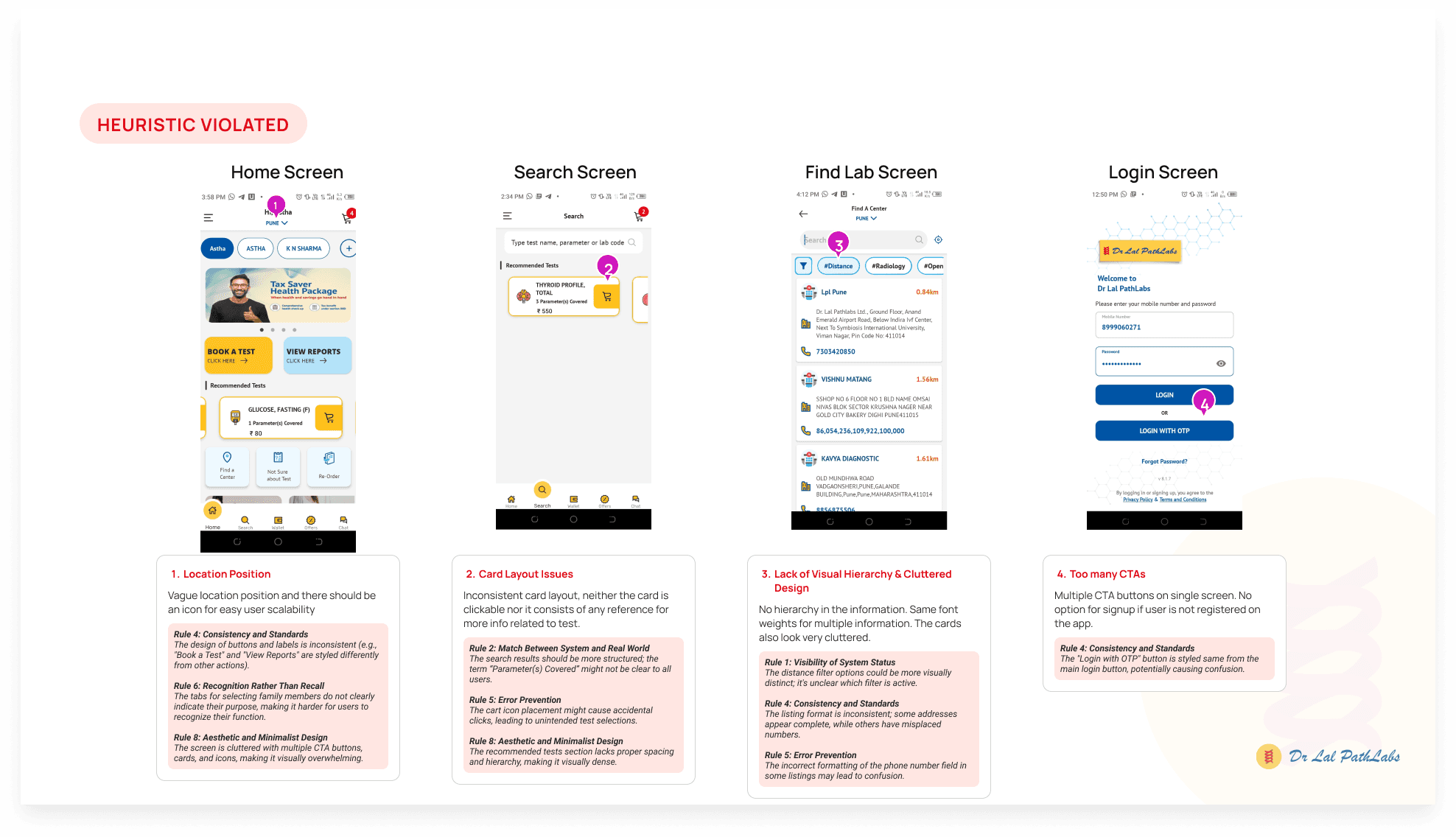
Before we designed anything, I knew we had to listen.
So we started by:
Reviewing user reviews & support queries
Conducting a UX audit to identify high-friction zones
Mapping user journeys to see where users dropped off or got confused
We realized users were being forced to think too much for tasks that should feel effortless. So we broke down the core flows — test booking, report access, and home visits — and rebuilt them with clarity.
Here’s a quick snapshot of our approach:
🧪 User Research to understand expectations vs. actual behaviour
🧱 Wireframing & Prototyping to explore simpler journeys
🔁 User Testing & Iterations based on early feedback
🎨 Design System Alignment for visual clarity and consistency
♿ Accessibility Considerations for older and non-tech-savvy users
Every decision we made was backed by empathy, because we weren’t just designing for clicks, we were designing for people dealing with health concerns.
With clear insights from both the client side and our UX audit, we made focused improvements that directly tackled the core problems.
Here’s what changed:
✅ Test Booking Flow: We reduced the number of steps, added logical grouping, and surfaced key actions up front
🏠 Home Collection Flow: We gave users better clarity with a step-by-step breakdown and real-time appointment tracking
📁 Report Access: We added visual cues and a single-screen summary that made locating and sharing reports feel effortless
🔔 Smart Notifications: We improved communication touchpoints to keep users updated without overwhelming them
🧭 Navigation Overhaul: Introduced a bottom-tab navigation that made sense with how users think
🧓 Inclusive Design: We made the interface cleaner, text more legible, and actions easier to perform — even with one hand
These weren’t just UI updates — they were experience shifts.
We turned stress into confidence, clicks into clarity, and friction into flow.
Categories
Healthcarae
Mobile App
Date
May 3, 2022
Client
Dr. LalPath Labs

Dr. LalPath Labs
Overview
A centralised digital platform designed to streamline the operations of CBG (Compressed Bio Gas) plants across India. It integrates scattered data from input materials to output generation, enabling real-time visibility, operational efficiency, and informed decision-making through intuitive dashboards and role-based access.
When I first looked into the Dr. Lal PathLabs app, it was clear that the brand had the right intentions — to make healthcare accessible, quick, and reliable. But as I dove deeper, the experience didn’t match that promise.
Users were getting lost in the app.
Some struggled to book a simple test, others weren’t sure how to schedule a home collection, and many couldn’t find their old reports when they needed them most. For something as sensitive and urgent as health, the experience felt clunky and disconnected.
Even regular users shared frustration:
“I’ve done this before, but I still don’t know where to go.”
This friction didn’t just affect users — it impacted the business.
1. There were booking drop-offs before completion
2. A rise in support calls
3. And a loss of user trust in the app’s reliability
This was a brand people relied on for health, but the app wasn’t holding up its end of the bargain.
Before we designed anything, I knew we had to listen.
So we started by:
Reviewing user reviews & support queries
Conducting a UX audit to identify high-friction zones
Mapping user journeys to see where users dropped off or got confused
We realized users were being forced to think too much for tasks that should feel effortless. So we broke down the core flows — test booking, report access, and home visits — and rebuilt them with clarity.
Here’s a quick snapshot of our approach:
🧪 User Research to understand expectations vs. actual behaviour
🧱 Wireframing & Prototyping to explore simpler journeys
🔁 User Testing & Iterations based on early feedback
🎨 Design System Alignment for visual clarity and consistency
♿ Accessibility Considerations for older and non-tech-savvy users
Every decision we made was backed by empathy, because we weren’t just designing for clicks, we were designing for people dealing with health concerns.
With clear insights from both the client side and our UX audit, we made focused improvements that directly tackled the core problems.
Here’s what changed:
✅ Test Booking Flow: We reduced the number of steps, added logical grouping, and surfaced key actions up front
🏠 Home Collection Flow: We gave users better clarity with a step-by-step breakdown and real-time appointment tracking
📁 Report Access: We added visual cues and a single-screen summary that made locating and sharing reports feel effortless
🔔 Smart Notifications: We improved communication touchpoints to keep users updated without overwhelming them
🧭 Navigation Overhaul: Introduced a bottom-tab navigation that made sense with how users think
🧓 Inclusive Design: We made the interface cleaner, text more legible, and actions easier to perform — even with one hand
These weren’t just UI updates — they were experience shifts.
We turned stress into confidence, clicks into clarity, and friction into flow.
Categories
Healthcarae
Mobile App
Date
May 3, 2022
Client
Dr. LalPath Labs
Dr. LalPath Labs
Overview
A centralised digital platform designed to streamline the operations of CBG (Compressed Bio Gas) plants across India. It integrates scattered data from input materials to output generation, enabling real-time visibility, operational efficiency, and informed decision-making through intuitive dashboards and role-based access.
When I first looked into the Dr. Lal PathLabs app, it was clear that the brand had the right intentions — to make healthcare accessible, quick, and reliable. But as I dove deeper, the experience didn’t match that promise.
Users were getting lost in the app.
Some struggled to book a simple test, others weren’t sure how to schedule a home collection, and many couldn’t find their old reports when they needed them most. For something as sensitive and urgent as health, the experience felt clunky and disconnected.
Even regular users shared frustration:
“I’ve done this before, but I still don’t know where to go.”
This friction didn’t just affect users — it impacted the business.
1. There were booking drop-offs before completion
2. A rise in support calls
3. And a loss of user trust in the app’s reliability
This was a brand people relied on for health, but the app wasn’t holding up its end of the bargain.
Before we designed anything, I knew we had to listen.
So we started by:
Reviewing user reviews & support queries
Conducting a UX audit to identify high-friction zones
Mapping user journeys to see where users dropped off or got confused
We realized users were being forced to think too much for tasks that should feel effortless. So we broke down the core flows — test booking, report access, and home visits — and rebuilt them with clarity.
Here’s a quick snapshot of our approach:
🧪 User Research to understand expectations vs. actual behaviour
🧱 Wireframing & Prototyping to explore simpler journeys
🔁 User Testing & Iterations based on early feedback
🎨 Design System Alignment for visual clarity and consistency
♿ Accessibility Considerations for older and non-tech-savvy users
Every decision we made was backed by empathy, because we weren’t just designing for clicks, we were designing for people dealing with health concerns.
With clear insights from both the client side and our UX audit, we made focused improvements that directly tackled the core problems.
Here’s what changed:
✅ Test Booking Flow: We reduced the number of steps, added logical grouping, and surfaced key actions up front
🏠 Home Collection Flow: We gave users better clarity with a step-by-step breakdown and real-time appointment tracking
📁 Report Access: We added visual cues and a single-screen summary that made locating and sharing reports feel effortless
🔔 Smart Notifications: We improved communication touchpoints to keep users updated without overwhelming them
🧭 Navigation Overhaul: Introduced a bottom-tab navigation that made sense with how users think
🧓 Inclusive Design: We made the interface cleaner, text more legible, and actions easier to perform — even with one hand
These weren’t just UI updates — they were experience shifts.
We turned stress into confidence, clicks into clarity, and friction into flow.
Categories
Healthcarae
Mobile App
Date
May 3, 2022
Client
Dr. LalPath Labs

